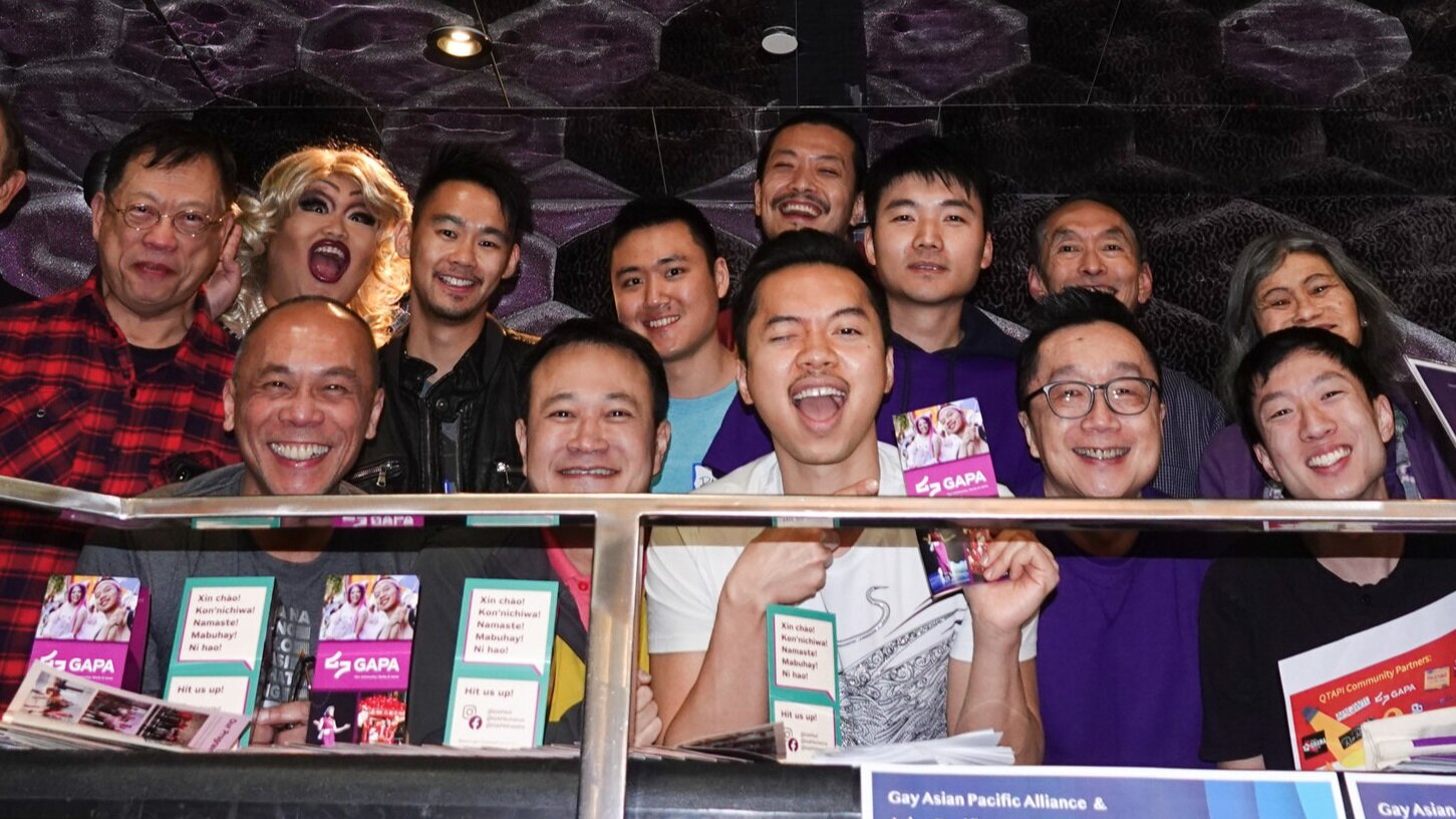
A Chosen Family
Expressing strength and unity through an enduring symbol
At the dawn of a new decade, GAPA has updated our vision, mission and values to better serve the current state of the QPAPI community. We’ve also pursued a new identity and tagline to start a new chapter of our storied legacy.

Pride 1990
As one of the longest continuously active LGBTQ API social-welfare organizations in the US, GAPA has been a stalwart for the advancement of the community for over 30 years. As our identities and intersectionalities have broadened since our modest beginnings as a men’s group, there was a clear need to deepen our alliance and commitment to the greater QTAPI family.
The Journey
Before we embarked on a journey of discovery and imagination, we aligned on our project goals by crafting a brief with the GAPA board and a brand council made of community partners across the QTAPI spectrum.

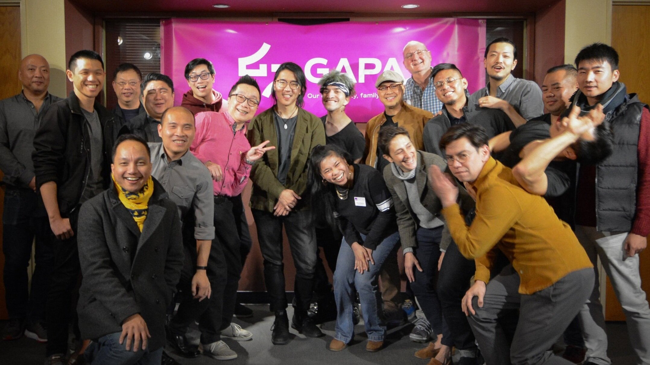
Board retreat 2019. We worked to reimagine GAPA for the needs of today’s community
Once key roles were identified, we set out to re-articulate GAPA’s mission and vision at our annual board retreat. It was a moment for face to face reflection and discussion to answer: “Why GAPA, why now?” Our passionate and fruitful conversations lead us to an expansive and clear statement:
“We see a world where a powerful QTAPI family is seen, heard, and celebrated through our advocacy, inclusion, and love.”
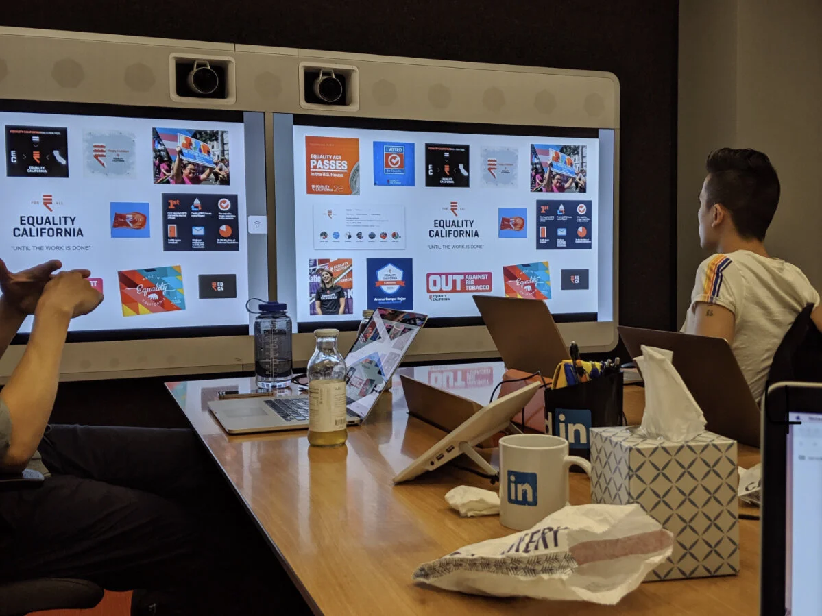
We looked at the non-profit design landscape together
This was also the first step of our collaboration in earnest with our partners. We met and discussed what would become the new brand core of GAPA.
We held workshops with the brand council
We got into the nitty gritty

Designed in 1999, our former logo and name appeared to be for only gay men and was overall a bit sinocentric
Beyond Gay
An early decision was to not completely change the name of our organization. There was too much love for GAPA and what we had accomplished together. We also believed that the authenticity of a community brand is measured by action, not only by name. Moving forward, our organization would be known simply as “GAPA”. Much like “YMCA” or “NAACP”, we wanted lean into a name that honored our heritage and brand equity without alienating communities we aim to serve. Plus, it’s already how everyone knows us!
A New Visual Identity
To start the visual design process, we enlisted a team of community designers to imagine what a new GAPA identity would look like that could both identify and unify us.
We explored directions under the following criteria:
It needed to feel inclusive to our broader community
It could not explicitly represent cis-gendered homosexual men
It needed to be simple, unique, and memorable


Inspiration + ExPLORATION
Our community has always been a mix of LGBTQ Asian-identified members. To reflect this, we looked at a range of Asian lettering as our main influences. We also explored directions using symbols with the themes of transformation, togetherness, abundance, and those with a visual sense of harmony.
A few of the directions we considered
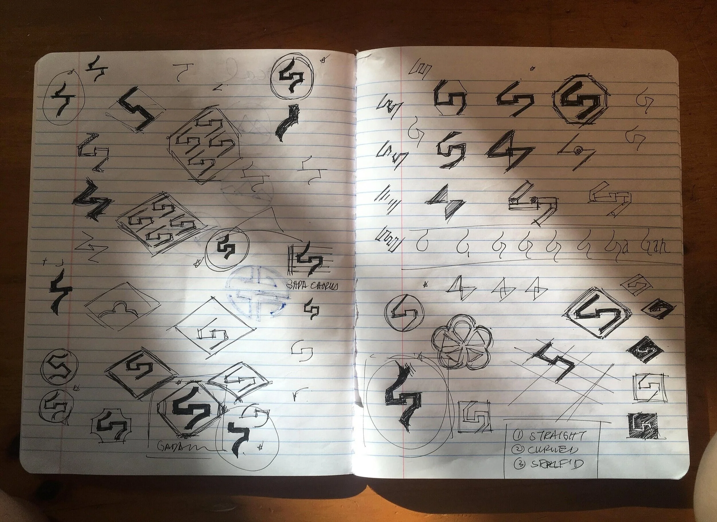
A page from a sketching session

Mike Tan and Jonathan Chavez lead the web team
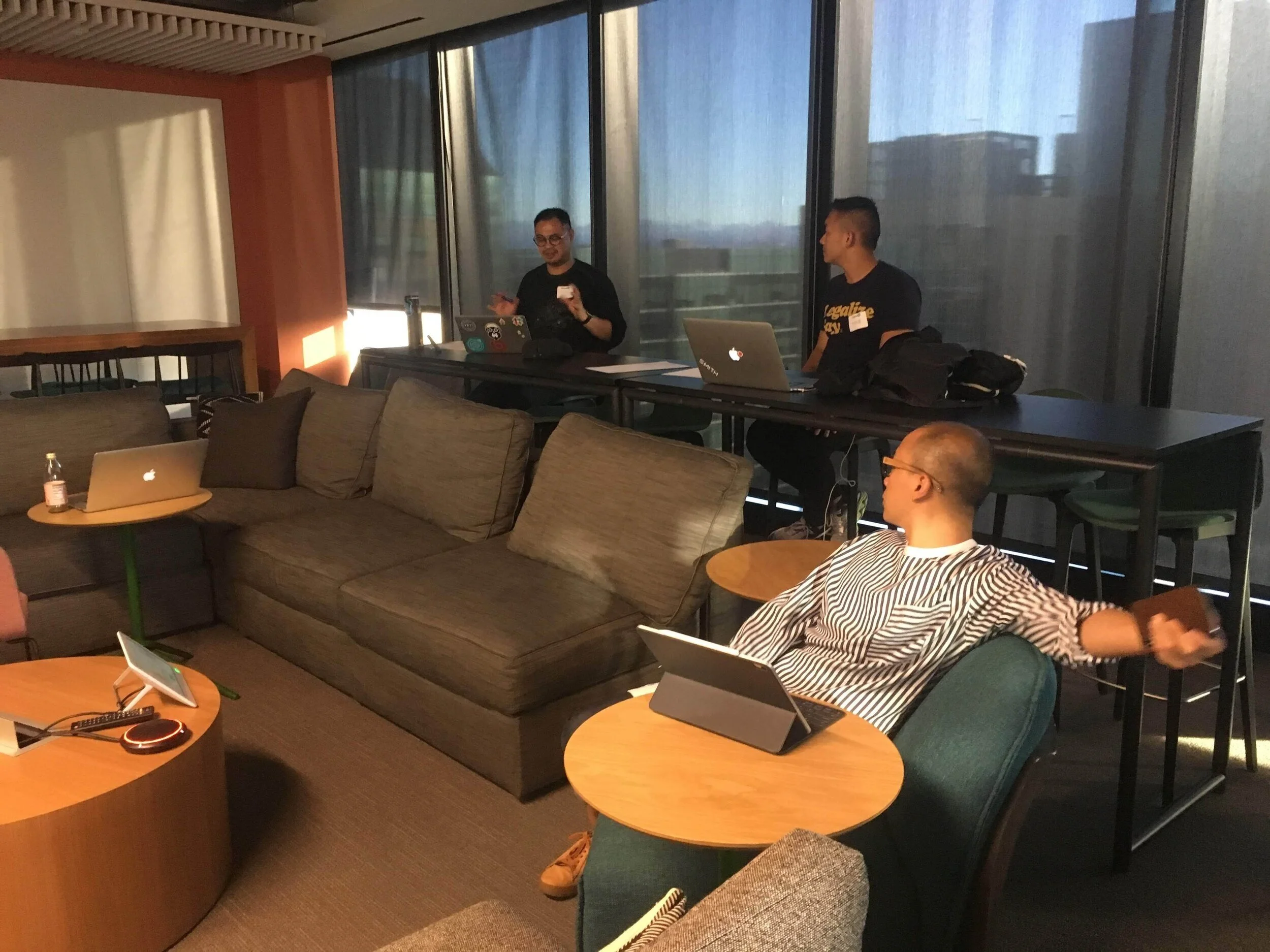
Designerds discussing design things at sunset 😍
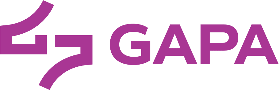
THE symbol
After considered rounds of design and feedback, we landed on a modern and abstract symbol so-simple-anyone-draw-it, with subtle echoes of “G-A-P-A”. This expanded our brand and allowed a respectful distance from explicitly being a gay organization. More importantly, we loved the symbol’s timeless evocation of unity, transformation, and power — something that we will always fight for.

THE logo
As we continue to build bridges in our broader community, our logo will appear with “GAPA” for the near future. This helps bridge the foundations of our past to the aspirations of our future. We hope that someday, the symbol will suffice.
An informed departure from our legacy gold
Brand color
As for our brand color, we brightened the GAPA gold and traveled across the color wheel to a deep lavender that we call “Power Purple”. Its hue is historically rooted in LGBTQ activism and is infused with a subtle warmth to represent the love shared within our chosen families.

What’s Ahead
We hope that our work reflects the incredible legacy of the last three decades and our continued commitment to building a powerful QTAPI family that seen, heard, and celebrated for decades to come. We realize that this evolution will, in practice, take time and effort. We hope that our new brand speaks to our enduring commitment to that effort.
In service,
Danny Chung, Brand Director
Michael Nguyen, Chair
Tony King, Vice-Chair
Thank you
We’d like to recognize a few folks from the community that shared their valuable time during this process. Thank you for your guidance and collaboration.
Steve Lew, Violet Sinclair, Randy Kikukawa, Alma Soongi Beck, César Cadabes, Anjali Rimi, Bernie Wong, Ty Lim, Dino Duazo, GAPA board members, GAPA Theatre, GAPA Men’s Chorus, Prism Foundation, Dylan Liang, Jonathan Chavez, Mike Tan, Paul Margolis, and Oliver Cacananta.
For logos, colors, fonts, and all things brand, visit our brand home.
